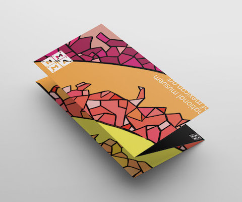
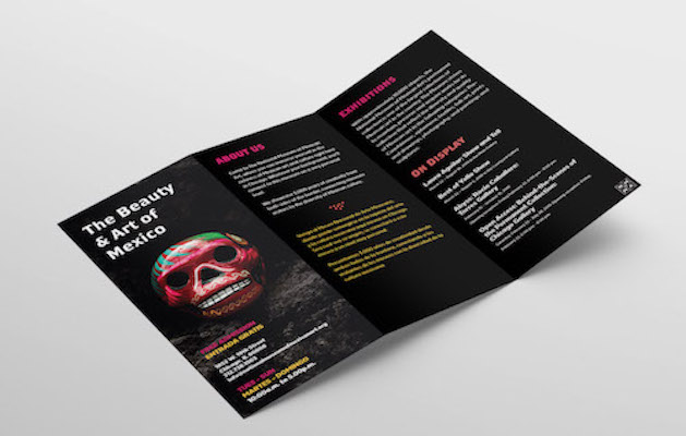
National Museum of Mexican Art Rebrand
The project is to give the National Museum of National Art a new brand identity. Our team will redesign their logo, layout, website, and brochure to update their visual aesthetics. Our redesign will give the museum a more contemporary,
eye-popping, and clear visual layout. Using color and cultural research, we will redesign their company to attract more viewers and give their information a clear, alluring visual format that also highlights Mexican art/culture.
In
1982, Carlos Tortolero organized a group of fellow educators and founded the Mexican Fine Arts Center Museum, which opened its doors in 1987. The goal was to establish a cultural and arts organization dedicated to social justice,
education, and accessibility. NMMA also wanted to provide a positive influence for the local Mexican community. At the time, many other art institutions did not address Mexican art, so this new-found organization had an important
impact. Since then, the institution has blossomed and its audience has broadened. In 2001, the museum expanded to 48,000 square foot, state-of-the-art facility in the heart of Pilsen and in 2006 revealed a new name: The National
Museum of Mexican Art. The National Museum of Mexican Art is located in Chicago. They showcase 3,000 years of creativity from both sides of the border, connecting museum visitors to the diversity of Mexican culture. They’re
located in Chicago’s Pilsen neighborhood. Their 10,000 piece permanent collection meets the highest museum standards. The quality of their collection is highly valued and their pieces and exhibitions travel to museums around
the globe.
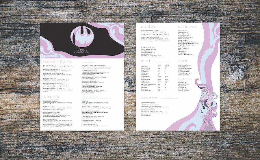
Mudspot Restaurant Rebrand
Mudspot Coffee house is a high-rated coffee shop in East Village, New York. This company is going through a renovation to expand their restaurant so they can accommodate more customers and have a new brand logo that will
attract more people’s attention.
Mudspot is immensely popular amongst the young, hip crowd of New York. With the rebrand, Mud’s objective is to appeal to the older and more sophisticated population in New York. They
want to shift their reputation from a groovy coffee spot, to a modish brunch place suited for all. Mud’s intention was not to lose their usual audience, but to expand their style to appeal to a larger target group.
In this project, Eva focused on combining the style of the 80’s with the sophistication of the modern era. The colors blue and purple keep the design youthful and fun, but the switch to cool color tones adds a sense of calmness
and maturity. With the logo, she kept the circular gure and sharpened it to re ne the groovy style. She added lines of wavy blue and purple gures to signify the warm aroma of coffee.This new logo should connect with a larger
population make Mudspot Restaurant a more renown and respected coffeehouse, which will will further popularize their company and boom their business.
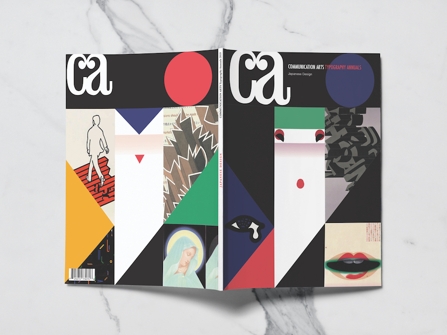
CA Editorial Design
Communication Arts is the largest international trade journal of visual communications. Founded in 1959 by Richard Coyne and Robert Blanchard, the magazine’s coverage includes graphic design, advertising, photography, illustration
and interactive media. In this issue, Communication Arts published a special edition magazine dedicated to Japanese Design after the World War. Eva and three other group members each designed two spreads on their chosen designers.
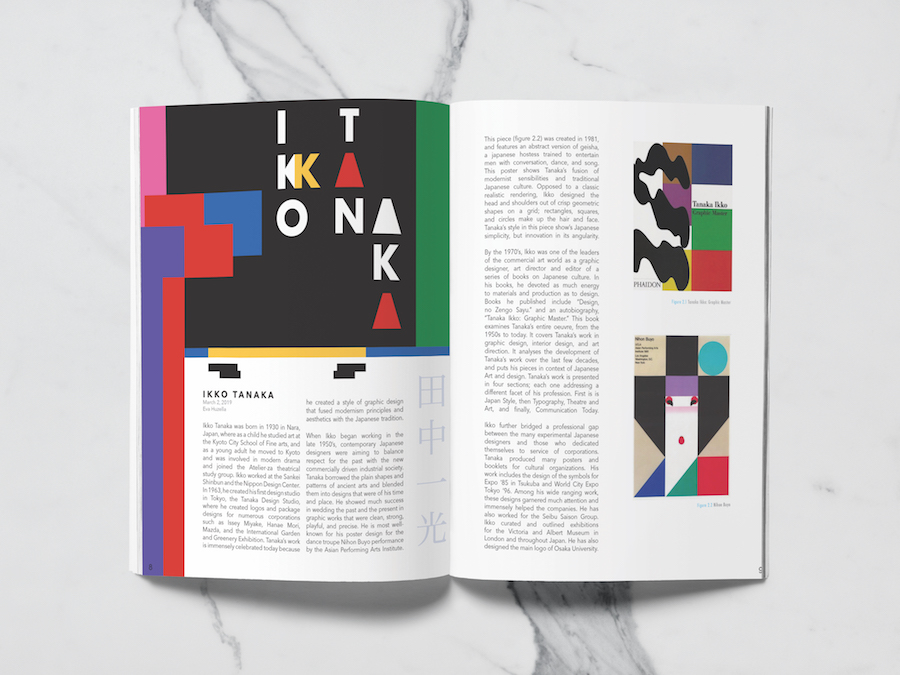
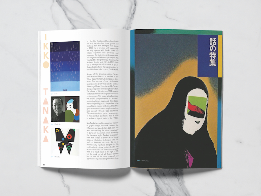
The Japanese designer Eva focuses on is Ikko Tanaka, a widely respected artist born in 1930. Tanaka’s work is immensely celebrated today because he created a style of graphic design that fused modernism principles and aesthetics
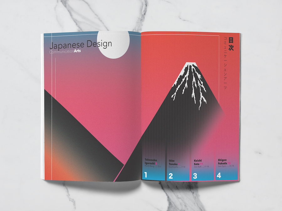
with the Japanese tradition. Eva used Tanaka’s style when constructing her article spreads. In addition to her article designs, she collectively worked with a team to create a cover, back cover, and a table of contents that
highlighted the Japanese era with each designer’s style in mind. She also created CA website layouts for the Macbook, iPad, and iPhone. The goal for the client was to create an eye-catching, unique design that does not only
stay true to the chosen historical era, but also draw people in to read the magazine. The primary consumers of this publication are those who are already established designers that have an interest in staying informed on the
present trends of design. The main mission of this project is to inspire, create excellence, and show people the best state of the art. Having Eva shine a light on the era of Japanese design and the works of Ikko Tanaka will
allow CA Magazine to further educate and enlighten the public, but also gain more subscribers and build business for the company.
Brazil Critique Article Graphic
Epoca is a Brazilian weekly news and analysis magazine that focuses on world news, science and technology, business, health, welfare, society, lifestyles, culture, religion, and more. This magazine’s style is based on the German
magazine Focus, emphasizing the use of images and graphics. Epoca’s new issue, “Dire Need for Reform,” talks about the severity of crime and corruption currently tormenting the people
of Brazil. Everyone in the country is
experiencing some type of fear and a dire need for progressive reconstruction in their government. The main intent of this article is to inform the people about the country’s faults, but also to remind Brazil to stay strong
and keep ghting for order.
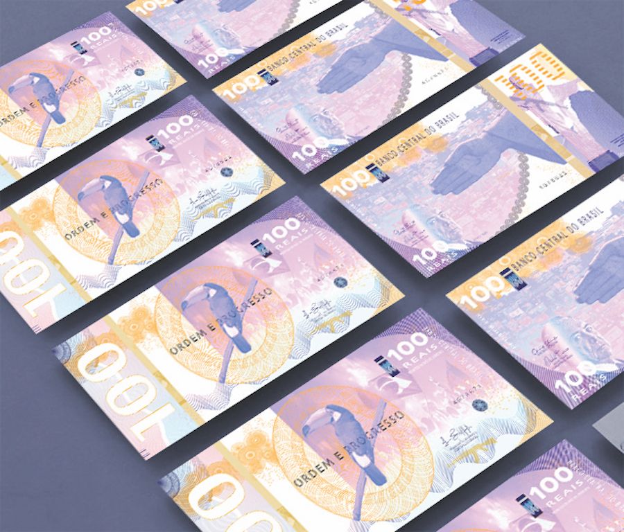
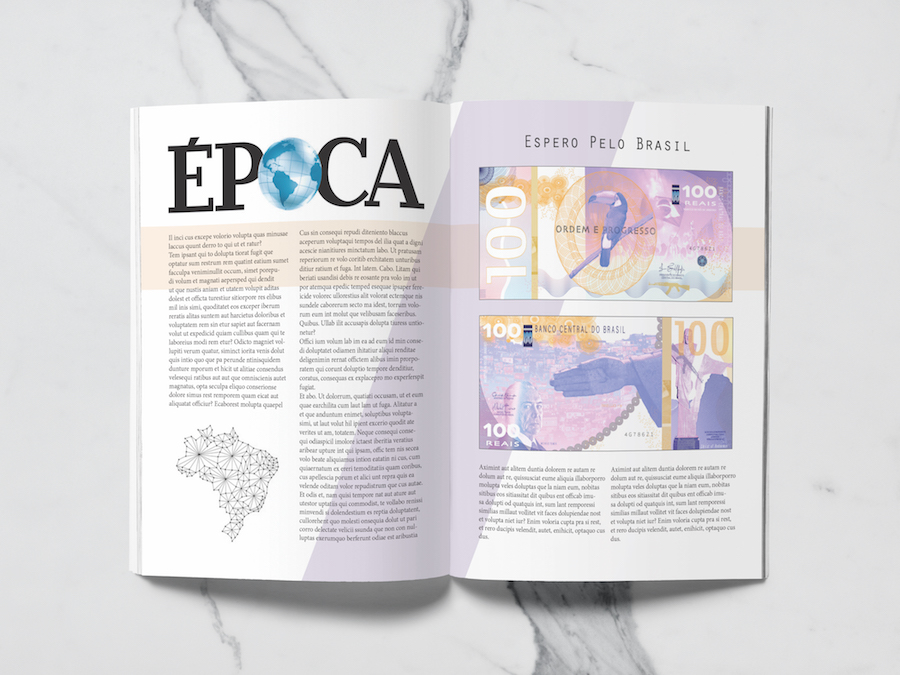
The economy and governmental disorder have a huge tie in Brazil. Epoca asked for a graphic of fake banknotes that highlight the faults and disarrays of the nation, to show a contrast from
the present-day currency design. Seeing a bill design will not only draw the viewer in, but also deliver an alternate, unique way of describing the downfall of Brazil’s government.
The fake currency was designed to
the same dimensions of Brazil’s real currency, but the colors were changed to purple and gold to bring together the juxtaposition of corruption and hope. Studies show that purple evokes the feeling of disorder or despair, while
gold and yellow represent the light of freedom and hope. For the front side of the bill, the national motto stands as the centerpiece accompanied with a toucan. “Ordem E Progresso” translated to “Order in Progress;” this maxim
gives the people of Brazil a hope that improvement and peace is being worked towards. The background image captures a riot where someone is holding up a large Brazilian ag. This graphic represents the entirety of the country’s
population and their demand to manifest an ef cient order to mend the government’s wrongs.
Brazil Currency Design: Epoca Article Graphic
Epoca is a Brazilian weekly news and analysis magazine that focuses on world news, science and technology, business, health, welfare, society, lifestyles, culture, religion, and more. This magazine’s style is based on the German
magazine Focus, emphasizing the use of images and graphics. Epoca’s new issue, “Dire Need for Reform,” talks about the severity of crime and corruption currently tormenting the people
of Brazil. Everyone in the country is
experiencing some type of fear and a dire need for progressive reconstruction in their government. The main intent of this article is to inform the people about the country’s faults, but also to remind Brazil to stay strong
and keep ghting for order.
The economy and governmental disorder have a huge tie in Brazil. Epoca asked for a graphic of fake banknotes that highlight the faults and disarrays of the nation, to show a contrast from the
present-day currency design. Seeing a bill design will not only draw the viewer in, but also deliver an alternate, unique way of describing the downfall of Brazil’s government.
The fake currency was designed to the same
dimensions of Brazil’s real currency, but the colors were changed to purple and gold to bring together the juxtaposition of corruption and hope. Studies show that purple evokes the feeling of disorder or despair, while gold
and yellow represent the light of freedom and hope. For the front side of the bill, the national motto stands as the centerpiece accompanied with a toucan. “Ordem E Progresso” translated to “Order in Progress;” this maxim gives
the people of Brazil a hope that improvement and peace is being worked towards. The background image captures a riot where someone is holding up a large Brazilian ag. This graphic represents the entirety of the country’s population
and their demand to manifest an ef cient order to mend the government’s wrongs.
MBCC Promotional Poster
The classic center is a venerable organization that restores and sells classicMercedes Benz cars. This center is a means of preserving the history and style of the past and incorporating it into the modern world. Mercedes Benz
classic center features an ever-changing selection of vintage cars, and allows people to sell their cars to the company so they can expand their collection. This classic center is a haven in the car community. Its purpose is
to nd more enthusiasts and help them restore and expand their collection. In this project, MBCC wants a poster design that will promote and spread awareness of the classic center.
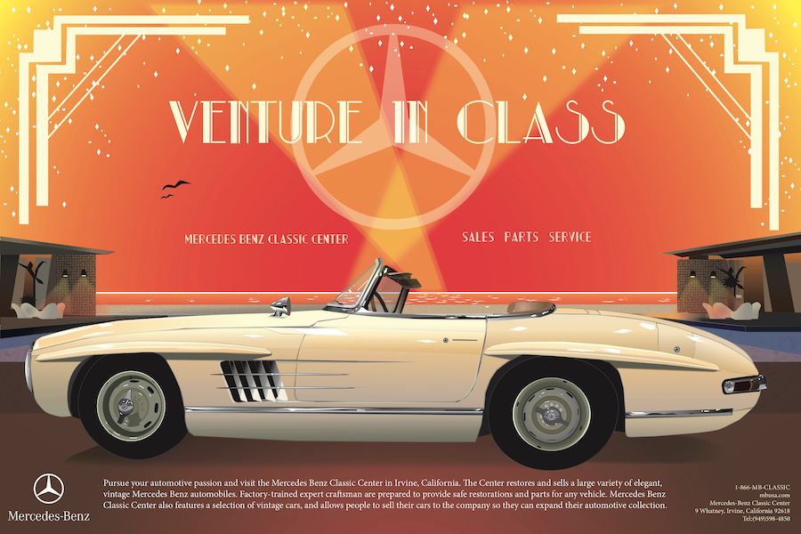
Eva designed an art deco styled poster to
advertise the luxury of Mercedes Benz Classic Center. This poster’s intent is to reel in car fanatics and get them to contact the center for parts or sales. Eva’s design is meant to resemble the life of opulence and class to
evoke a feeling of desire within the audience. To capture the art deco style, she designed frames inspired by Gatsby, re ned an art deco font to t the aesthetic of the poster, and spent many hours designing a glamorous Mercedes
car. This project was designed to pertain to the wealthy car lovers that crave the life of luxury. This poster’s promotion of the classic center aids Mercedes in their advertisement and gains the company more business.
MBCC Promotional Poster
The classic center is a venerable organization that restores and sells classicMercedes Benz cars. This center is a means of preserving the history and style of the past and incorporating it into the modern world. Mercedes Benz
classic center features an ever-changing selection of vintage cars, and allows people to sell their cars to the company so they can expand their collection. This classic center is a haven in the car community. Its purpose is
to nd more enthusiasts and help them restore and expand their collection. In this project, MBCC wants a poster design that will promote and spread awareness of the classic center.
Eva designed an art deco styled poster
to advertise the luxury of Mercedes Benz Classic Center. This poster’s intent is to reel in car fanatics and get them to contact the center for parts or sales. Eva’s design is meant to resemble the life of opulence and class
to evoke a feeling of desire within the audience. To capture the art deco style, she designed frames inspired by Gatsby, re ned an art deco font to t the aesthetic of the poster, and spent many hours designing a glamorous Mercedes
car. This project was designed to pertain to the wealthy car lovers that crave the life of luxury. This poster’s promotion of the classic center aids Mercedes in their advertisement and gains the company more business.